The San Jose Sharks dropped a pretty big surprise on us today, unveiling their new uniforms for next season. Let's take a look, shall we?

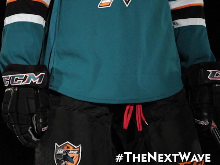
Nice to see Brent Burns' beard is still part of the new sweaters. They've replaced the black shoulder yolk with teal, and gone to a lace-up collar. I also like that most of the orange is..wait a minute.
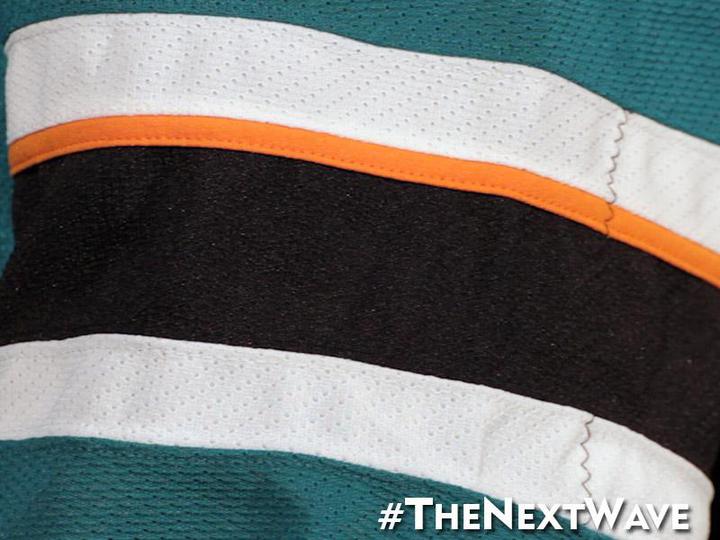
Well, okay. I can live with a little orange, I guess. The stripes not going all the way around the sleeves is REALLY irritating, though. Hopefully the stripes on the bottom of the jersey match the weird pattern on the sleeves. Let's see.
Dammit, Sharks. I didn't like not having bottom stripes when the Bruins did it, I hated it when Dallas did it, I abhor the stupid, stripe-less template Ottawa and Pittsburgh both use, HOCKEY JERSEYS ARE SUPPOSED TO HAVE STRIPES ON THEM. This isn't baseball, the late-70s Pirates excluded. Ughhh.
Can we see the white jersey, just to get it over with?
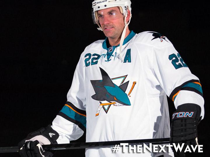
This brings up a point I actually do like about these new jerseys. The numbers have been reduced from 3-color to 2-color, and look way less cluttered now. I don't even mind the front numbers too much, though as has been proven in the past, when you have to add a patch as a memorial, or to celebrate an anniversary, you have to find weird places to stick it. In short, it clutters up what I just said was made less cluttered.