If you follow me on twitter (@ThatShaneBua), you've by now probably realized that I'm a bit of a uniform nerd. It's probably why I'm such a hockey fan. If I had the money to assemble a closet full of my favorite all-time sweaters, it'd be a rather large collection (next target: one of the Mighty Ducks' late-90s jade alts).
That said, both the Dallas Stars and the Carolina Hurricanes have released their newest uniforms earlier this week, and I'm here to guide you through what you'll be seeing on the ice this fall.
Note: Minnesota will be unveiling a new white sweater sometime this summer, and there's rumors that San Jose and Montreal (yes, Montreal) will also be getting new unis. I don't expect much of a change with the Habs, honestly. Probably a switch to a lace-up collar.
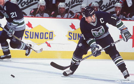
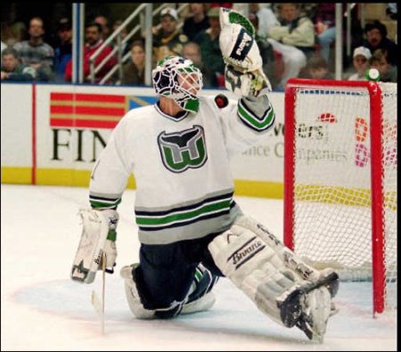
The one thing that's ALWAYS bugged me about the Hurricanes' sweaters (aside from the fact that they left Hartford) was the hideous yoke piping. You can put trim on your shoulders when there's actually something to put trim on. This trend has sadly caught on, ruining what are otherwise gorgeous sweaters for the Hershey Bears.
But take a look at the new ones! The piping is gone, and so are the incorrect flags (hurricane flags are two vertical flags, guys). The latter seems to be universally hated by 'Canes fans, but it's correct, dammit!
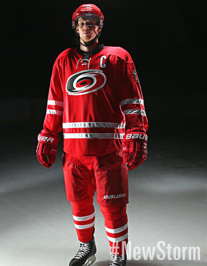
Home:
Old
New
Away:
Old
New
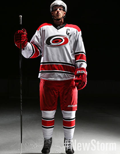
The Hurricanes are switching things up, going with a decidedly more classic look for this season. Every thing's been simplified, which is a definite plus in my book. The old tall stripes/tropical storm flags have been replaced by two thin stripes, and the flags have been relegated to trim inside of the collars. Speaking of, they've also added the supertrendy lace-up collars on the home sweater. The white sweater gains an actual, untrimmed yoke. A lot of people have already made the comparisons between what was teased of the new Hurricanes uniform and those worn by team Canada, and it's pretty apparent, but nothing I'm going to complain about. An absolutely solid upgrade over their previous uniforms. My favorite thing? The use of silver as a trim on the numbers and lettering. Very subtle. Least favorite? They're keeping the black alternates.
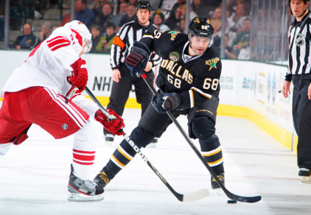
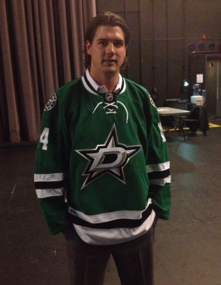
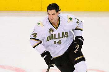
The Stars have been seemingly teasing a uniform redesign for about a year, now. Originally, it was thought that they'd switch over to a red/white/blue color palette, but that's since been debunked. The only change in color that the Stars have made was to ditch gold, and replace it with silver. Black and green remain as the team's primary colors, as they have been since 1991, though with a little more emphasis on green.
Home:
Old
New
Away:
Old
New
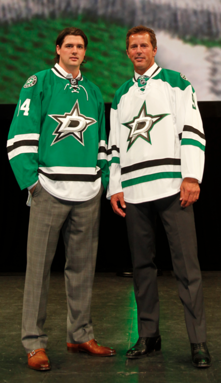
Okay, a LOT more green. I don't know what I was expecting from the Stars, but for some reason this wasn't it. But let's start with the key point on these uniforms: THE NUMBERS AND CITY NAME ARE GONE. No longer does the sweater look like a cut-rate football jersey. I'm not the hugest fan of the new crest, but this is a good upgrade. The alternating black and green stripes on the away sweater are a great touch.
The huge problem? The green sweater looks a little too familiar, no?
All in all, I think both teams went for addition by subtraction, using very modern, yet simple designs. Good looks for both, and they should look pretty rad on the ice this fall.